After the first slab was done, only stairs portion was remaining to be cast. However, our masonry contractor started acting up again and wanted funds released even before the work was complete. He had totally lost interest in doing this project. Only because of the person he had appointed to do all the RCC framework who was immensely efficient and professional, we were tolerating his antiques.
However, we had had enough and decided to fire him from the job. We were hoping that the person that was doing the actual work would stay to complete the work, but this guy just didn't let him work. So, the entire team cleaned up the premises and left.
It took good 4 weeks before the new team started work! Yes, we have bags full of ice on our heads...
This time coincided with the visit of our architect. We looked at the design and started considering a couple of changes.
1. Moving the entry area out of the front door:


.
2.Open kitchen layout:


However, we had had enough and decided to fire him from the job. We were hoping that the person that was doing the actual work would stay to complete the work, but this guy just didn't let him work. So, the entire team cleaned up the premises and left.
It took good 4 weeks before the new team started work! Yes, we have bags full of ice on our heads...
This time coincided with the visit of our architect. We looked at the design and started considering a couple of changes.
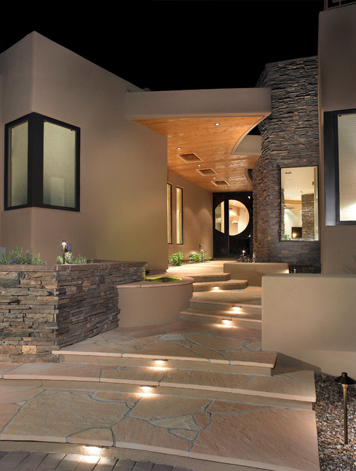
1. Moving the entry area out of the front door:
Once we saw how small the entry area will be, we thought of moving the door to the angled wall. This would make entry into the house very awkward. So, our architect suggested we move the entry area out of the front door. This allows for large entrance porch that can be decorated to give a very welcoming feeling. Something that looks like this:
Our Ground Floor design was updated to accommodate this change. We brought the entrance door inwards next to the lift shaft.
.
2.Open kitchen layout:
Once all the centering supports opened up, we saw how beautiful the helical staircase would look at the ground floor level if we opened up the kitchen.
Pros: Entire ground floor great room layout opens up, gives very airy feeling to the kitchen, living, dining area. Allows for a large island that was on our original wishlist.
Cons: Lose lot of cabinet space and storage space. Also, as soon as you enter the house, you see the open kitchen. This is actually a big point going against this design.
All in all, we considered it, but decided against doing something like this and decided to go for the original closed kitchen design.3. Drawing room glass facade:
Here we had a real tough time finalizing details. Our architect felt that although they had given original design of glass facade with spider glazing, we should try and avoid it. We should have some different kind of facade where we do not use spider hardware. For reference, here is our original design:
Glass facade on the left looks very clean, giving perfect proportions to the elevation.
However, if we want to get rid of the spider design, we need a horizontal member to support glass on top. And make sure we get maximum possible size of glass above the member. New render looked something like this. We also incorporated wall till the sill level.
Pros: New design gets rid of spider hardware that might be outdated in coming years.
Cons: Horizontal MS member compromises the clean look that we so desperately want in that area.
Final verdict is to stick to the spider design with glass going till about 8" above the ground level.
No comments:
Post a Comment